— Case 01 · 9 min read

The credit card people couldn't afford

A 3% conversion rate told us users didn't understand the product. Research told us they couldn't afford it.

Roles
Senior Product Designer (Lead)
Team
UX Writer (partner). Mid-level PD (early). Sole designer from mid-2025.
Year
2024 — Present
Format
Mobile App · Fintech
Tarjeta Control · 3 final product mockups
Project timeline
Jan 2024
Discovery
Jul 2024
Launch
3% conversion
Mid 2025
Rebrand
7% conversion
2026
New model
12% conversion
Fig 02Project timeline · January 2024 to present.
— Context

Tenpo's secured credit card was the first product of its kind in Chile. The mechanic existed regionally — Nubank had pioneered it in Brazil, and similar models ran in Mexico and Colombia — but no one had built it for the Chilean market.

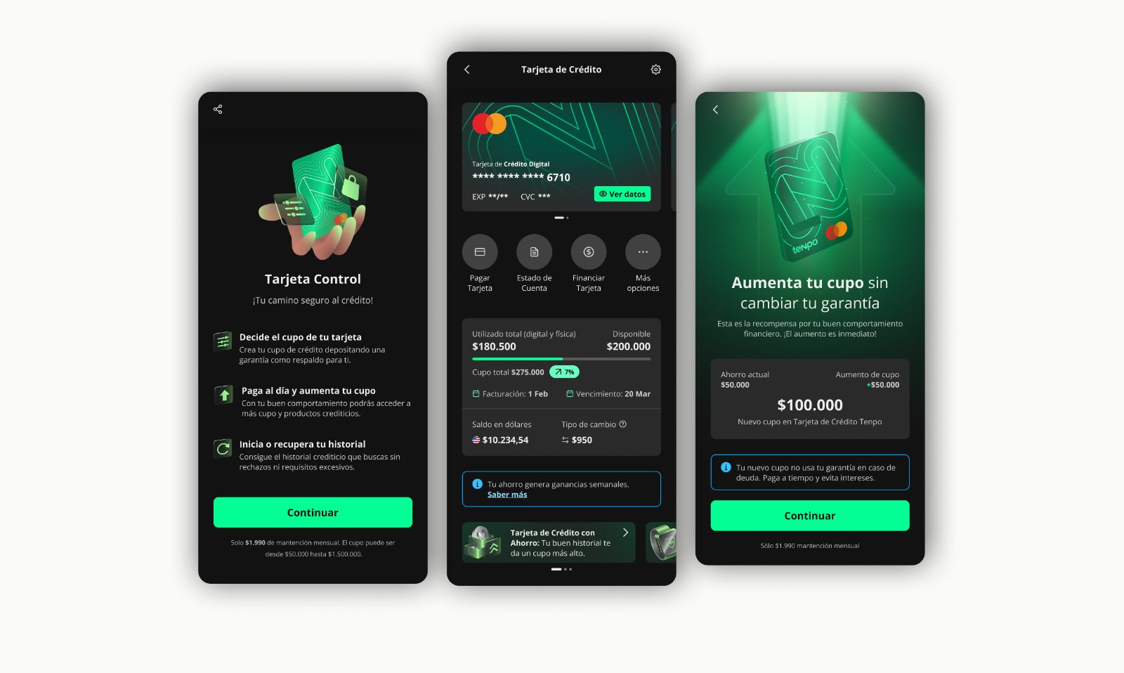
The product is straightforward: the user deposits 50.000 CLP, which becomes a fixed-term deposit and defines the card's credit limit. Unlike a prepaid card, the deposit isn't auto-debited — the user pays the monthly statement separately. The deposit stays put as long as payments are on time.

The target was two segments invisible to traditional banking: people without credit history (young adults, homemakers, first-time earners) and people with damaged credit scores. For Tenpo, this was financial inclusion plus a strategic on-ramp: bring underserved users in, build credit history, eventually graduate them to the unsecured card.

I joined in January 2024, at discovery. I'm still on it.

— Act 01

The cautious launch

January — July 2024

Designing a financial product nobody in Chile had built before

Discovery started with two workshops. The first was internal — I facilitated a session with the PO, business stakeholders, and the credit team to surface assumptions, constraints, and what success looked like from each function. The second was with users from the target segment, to understand how they thought about credit, debt, financial visibility, and what kind of product would actually feel useful.

There was prior business research on the segment, which I built on rather than duplicated. The qualitative depth came from the workshops; the segmentation and market sizing came from the existing internal work.

Two early decisions shaped what we shipped.

Naming

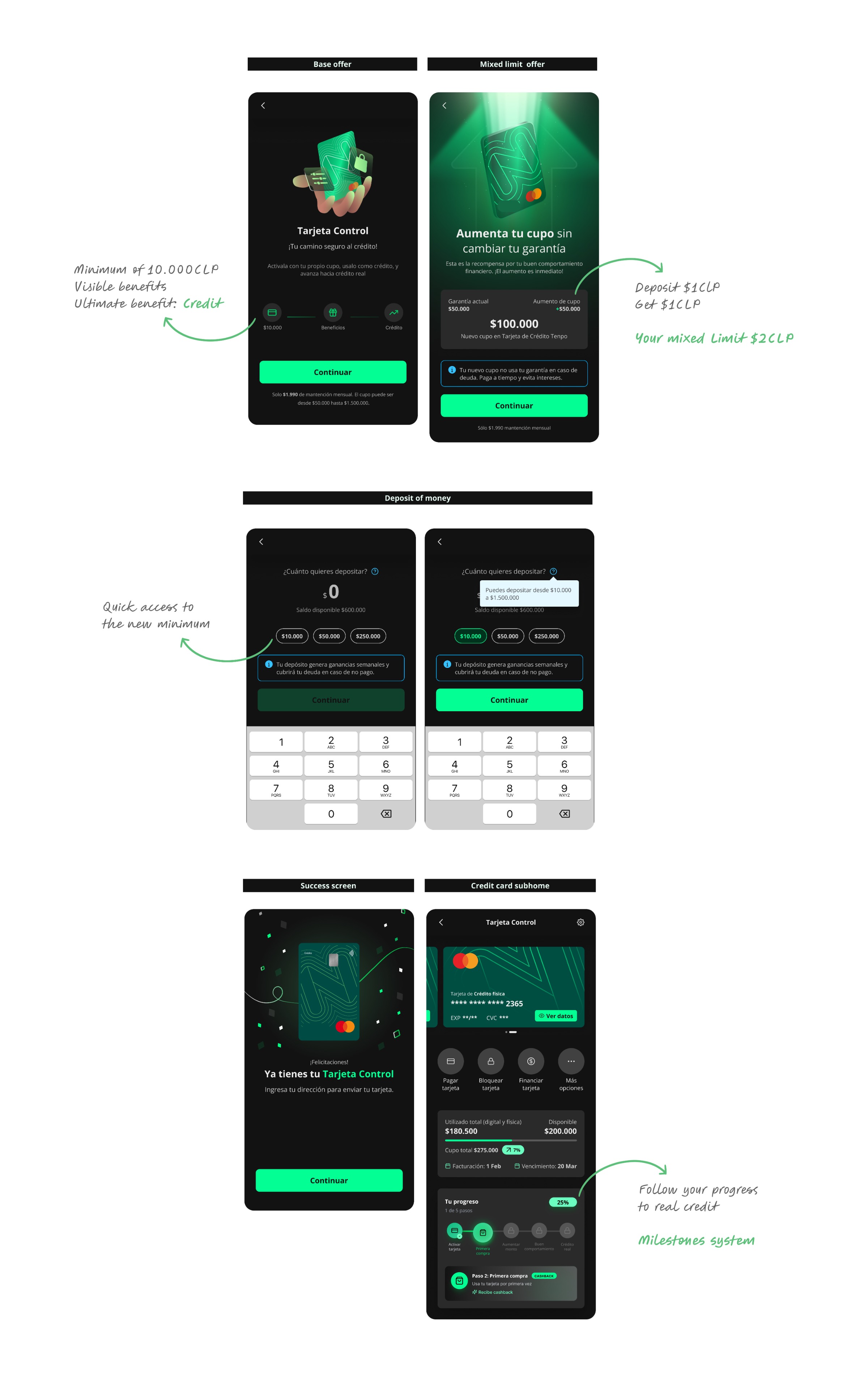
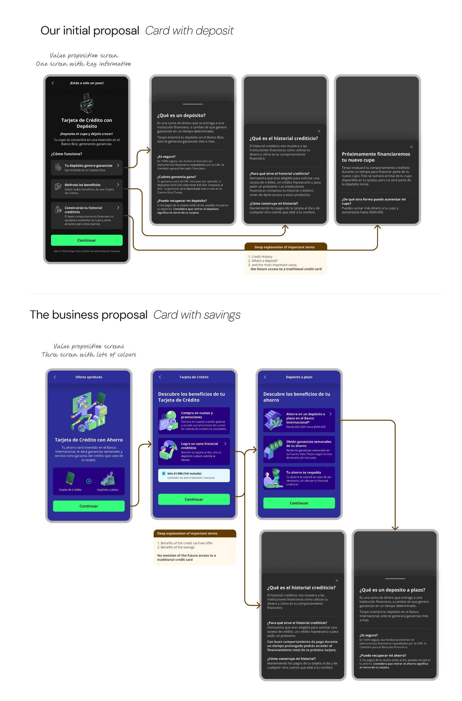
The product was originally going to be called tarjeta con garantía — "card with collateral." We tested the name with users and found it didn't communicate the product. The word garantía didn't connect to anything concrete. Tarjeta con depósito — "card with deposit" — landed better, because it described the actual action the user had to take. We changed the name before launch.

Original
Tarjeta con garantía
Didn't communicate
"Garantía" didn't connect to a concrete action. Users couldn't picture what they were being asked to do.
Tested
Tarjeta con depósito
Connected to action
Described the actual action the user had to take. Changed before launch.
Fig 03Naming test · A/B with target-segment users.

Reusing the existing onboarding

To meet the launch timeline, we built the new flow on top of the existing onboarding for Tenpo's traditional credit card. It was a deliberate trade-off: faster development, known constraints. We knew it would generate friction we'd have to work around later.

The product launched in July 2024 to a friends-and-family cohort. We tested the flow before launch, ironed out usability issues, and went live.

The result

Onboarding v1 — Payment date, Contract, and Deposit screens, with the deposit step marked as the primary drop-off point.
Fig 04Onboarding v1 — three of the inherited steps, with the deposit screen as the primary drop-off (63%).
3% conversion · major drop-off at the deposit step.

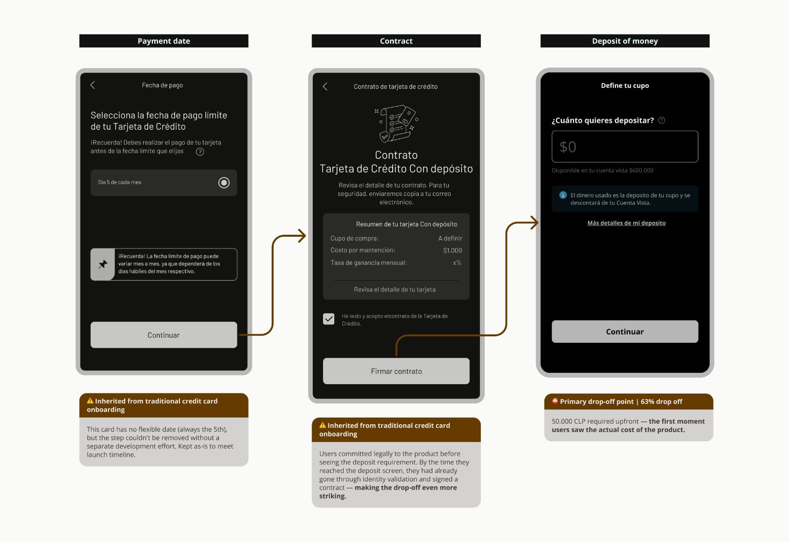
The first hypothesis was almost mechanical: people wanted a credit card, but when they saw they had to deposit money to get one, they walked. The launch had also gone live at month-end, when liquidity is at its lowest in this segment. We assumed this was timing plus a self-selection effect, and that the numbers would correct.

They didn't.

— Act 02

The wrong hypothesis

August 2024 — Mid-2025

Two teams, two diagnoses. Only one had data.

As the product underperformed, the diagnosis split.

The business team's reading was that users didn't understand the product. If we explained it better — clearer copy, sharper value proposition, more education in-app — conversion would follow. From the design and research side, my reading was different: comprehension was a real but secondary issue. The dominant barrier was liquidity.

While that disagreement played out, a separate problem appeared. The product started being communicated externally as tarjeta con ahorro — "card with savings." That introduced a third name into circulation alongside tarjeta con depósito (in-app) and tarjeta con garantía (legacy internal). We now had three names for one product, in a market that hadn't seen this product type before.

The deeper issue was misalignment of value. In-app communication framed the card around credit-building. External communication leaned on the deposit as a savings product — but the deposit's interest rate (~7% annually) was below market alternatives. We were selling two different products on two different surfaces, and neither was landing.

Side-by-side comparison: 'Our initial proposal — Card with deposit' (one value-proposition screen with deep explanations of credit history, deposit, and future access to a traditional credit card) versus 'The business proposal — Card with savings' (three colorful value-proposition screens emphasizing the savings benefit, with no mention of future access to a traditional credit card).
Fig 05Two proposals on the table: design's "card with deposit" framing vs. business's "card with savings" framing.

The research that resolved the disagreement

To move past internal debate, I led research designed to answer one question: what is actually stopping users at the deposit step?

— 01 · Interviews

Users in the target segment who dropped or never started.

+20 interviews · Google Meet and phone calls
— 02 · Surveys

Extending qualitative findings to a larger sample.

Pattern validation
— 03 · Guerrilla testing

In-context sessions executed by the Chile design team.

Protocols designed remotely from BA
— 04 · Behavioral analysis

UXCam session reviews and funnel analysis on the deposit step.

Quantitative triangulation
Fig 06Four methods triangulating on one question.

What we found

Comprehension was real but not dominant

About 60% of users understood the product correctly. About 40% didn't fully understand, and some confused it with a prepaid card. So there was a comprehension problem — but it wasn't the bottleneck.

Liquidity was the dominant barrier

The vast majority of interviewed users simply didn't have 50.000 CLP available to leave immobilized. Not "didn't want to" — didn't have.

There was a viable threshold

When asked what amount they could realistically commit, users converged around 10.000 CLP. Many also liked the idea of starting low and increasing the limit progressively as they gained confidence in the product.

This reframed the conversation. The product wasn't failing because users misunderstood it. It was failing because we were asking too much from a segment defined by having too little.

— Insight
60% understood the product. 40% didn't. But the dominant blocker wasn't comprehension — it was 50.000 CLP.

The organizational layer

Even with the evidence, the business hypothesis held. To resolve the question, an external consultancy was brought in to investigate independently. Their findings converged with ours: a liquidity barrier, a confused naming structure, and a value proposition built around future benefits the segment wasn't motivated by.

In parallel, I shipped the changes that were approved as quick wins: a short in-app video tutorial addressing the comprehension gap, iteration on copy and value proposition, and a final rebrand. The product became Tarjeta Control — repositioning the value around control over how much you deposit, how much credit you have, and how you use it. The credit-history benefit stayed in the narrative, but translated into something more concrete: become visible to other banks, open access to real credit later.

The result of Act 2

3% → 7% conversion

A meaningful jump from copy, framing, and onboarding work alone. But the curve flattened, and the deposit step kept being the ceiling. No amount of better explanation was going to fix what wasn't an explanation problem.

— Act 03

Changing the model

Mid-2025 — Present

Stop fixing the words. Start fixing the deal.

By this point, the team had thinned. The mid-level product designer had left Tenpo. The senior UX writer I'd been working with had gone on maternity leave and a new writer joined. I was the only designer on the project.

The argument I brought to business was direct: we'd taken UX writing and framing as far as they go. The 7% ceiling wasn't a copy problem. It was a model problem. The product was asking the user to give up real money today for an abstract benefit later, and the segment wasn't built to take that trade.

I led the redesign of the model itself. Three changes:

1. A progressive milestones system

Instead of presenting the card as a single threshold to cross, the experience became a sequence of milestones, each with a tangible benefit:

— Fig 07 · Strategic model

A 5-milestone journey, with rewards visible from the start.

— 01
Trigger
Activate the card
Initial deposit → immediate cashback
— 02
Trigger
First purchase
Benefit at a partner merchant
— 03
Trigger
On-time first payment
Reinforcement of the behavior business needs
— 04
Trigger
Increase your limit
Add more to the deposit
— 05 · Goal
Outcome
Access real credit
Tenpo-extended credit, no longer backed by the user's deposit.
Fig 08Milestones component · in-app interaction.

The user could now see the path. Each step had a reason to take it, and the final step — actual credit — was visible from the start.

2. Mixed credit limit for lower-risk users

For segments that risk approved as eligible, Tenpo would match part of the deposit with bank-extended credit. Deposit 50.000 CLP, get 100.000 CLP in available limit. The product stopped feeling like "I'm using my own money" and started feeling like real credit.

3. Lower entry threshold

The minimum deposit to activate dropped — research had validated 10.000 CLP as the viable entry point for the segment.

The argument that moved it

The case to stakeholders rested on three pieces of evidence converging:

  • Internal qualitative research (interviews + surveys)
  • External consultancy findings
  • Behavioral data from UXCam and funnel analysis

The shared diagnosis was no longer debatable. The conversation shifted from how do we explain this product better? to what are we asking the user to give up, and is it worth it from their perspective? Once that frame held, the model changes followed.

Risk team approval was the unlock. Once risk validated the mixed-limit model and the lower threshold for specific user segments, the proposal cleared.

Implementation by phases

The new model didn't ship all at once. Business was still cautious about lowering the entry threshold, so the rollout went in stages:

  • Phase 1. Milestones system + mixed limit for eligible segments.
  • Phase 2. Lower minimum deposit, after Phase 1 data confirmed the direction.

The result of Act 3

7% → 12% conversion · from baseline

The deposit step is no longer the dominant drop-off. The product is now meeting the segment where it actually lives.

Final Tarjeta Control flow — base offer, mixed limit offer, deposit of money, success screen and credit card subhome — annotated with the new design decisions: minimum of 10.000 CLP with visible benefits, mixed limit (deposit $1 CLP, get $1 CLP), quick access to the new minimum, and a milestones system to follow your progress to real credit.
Fig 09Final product in use · current Tarjeta Control, with the new minimum, mixed limit and milestones system annotated.
— Closing

What I learned

UX writing fixes understanding. It can't fix a product model that asks too much from the user.

Microcopy and framing took us from 3% to 7%. That was real impact. But the ceiling we hit at 7% wasn't a comprehension ceiling — it was a structural one. You can't write your way out of a deal the user can't afford to take.

When research and business intuition disagree, the answer isn't louder communication — it's better evidence.

Holding an unpopular position for months requires data, patience, and sometimes a third actor — in our case, an external consultancy — to unblock the conversation. The evidence wins eventually, but only if you keep building it.

— Closing line

You can't write your way out of the wrong product model.

— Next case · 02 / 03

One payment, 300 services

Continue →